Hi, I’m Olga S., a designer at Sosna with 26 years of professional experience. What I love most about my job is the creativity it allows me to explore and the amazing people I get to work with every day. My favorite design style is Art Deco, as I appreciate its blend of elegance and boldness. When I’m not working on home transformations, you’ll often find me immersed in my hobbies—art and painting. My motto is, “Man’s dearest possession is life. It is given to him but once, and he must live it so as to feel no torturing regrets for wasted years,” and I strive to bring that passion and purpose into every project I take on.
One of the most common questions I get in my job as a designer is What Colours will Work Best in My Home?
I get asked this question a lot, so I thought it would be helpful to share some of my tips on choosing the right paint colours for your space. Let’s start with a quick and easy overview of the color theory to help guide you.
One of the most influential studies on colour harmony was introduced by Johannes Itten at the most famous Bauhaus art school in Germany during the 1920s. In his work and teachings, Itten highlighted the psychological effects of colour and its ability to shape people’s emotions and experiences. His theories on colour combinations inspired designers to explore new palettes and innovative design practices, leaving a lasting impact that continues to guide the field today.
Understanding the Basics
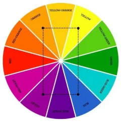
The colour wheel, as depicted below, is built on a foundation of three primary colours: yellow, blue, and red. These primary colours cannot be created by mixing other colours together and are the foundation of all other colours.
From these, secondary colours are created—orange, green, and violet—each formed by mixing two primary colours in equal proportions.
Then we have tertiary colours, which result from combining a primary colour with a secondary one.
Grasping these relationships is essential to anyone who think and worry about and also love colours.
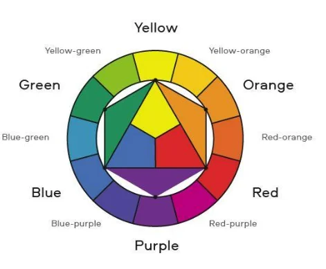
Let’s Build Our Palette for the space you are thinking of:
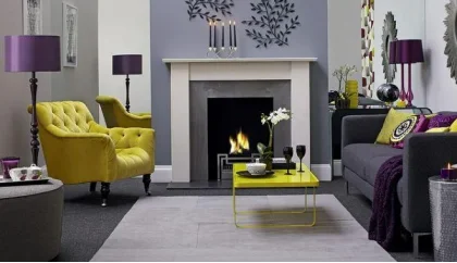
Colour Scheme A. Complementary Colors
For maximum contrast and visual impact, using colours that are opposite each other on the colour wheel – known as complimentary colours – can create bold, vibrant and intricate designs. The illustration below showcases complementary colours, highlighting pairs that are opposite on the colour when.

Colour Scheme B. Triadic Colors
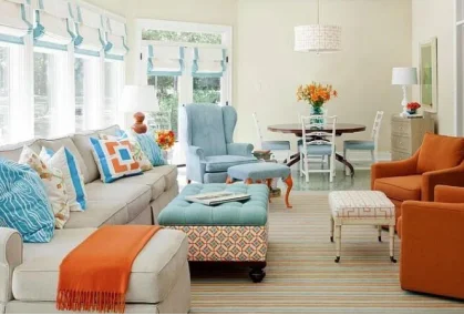
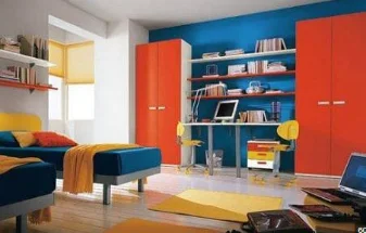
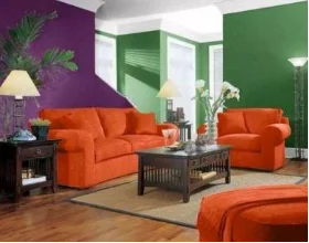
Triadic colors are three equidistant colours on the colour wheel. This approach involves designating one color as the dominant shade (about 60%), while using the other two as accents (30% and 10%). Obviously the numbers cannot always be literally applied in an interior setting, it is just an inspirational scheme.
The selected colour is the main player and the focal point, while the other two compliment it. This scheme creates a balanced and dynamic palette, offering both contrast and harmony in a design.


Below are some examples of triadic colour pairings effectively utilized in designs:
Colour Scheme C. Analogous Colors
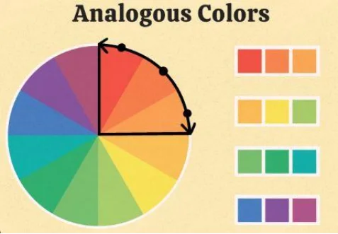
Analogous colours are three colours that are next to each other on the color wheel, as depicted below. These colours share similar hues, and their combination results in a harmonious, unified and pleasing look.
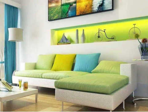
Below is an example of an analogous colour pairing in a design:
Colour Scheme D. Tetradic Colors
This scheme involves four colors in a rectangular arrangement on the color wheel. Two colours are chosen from one complementary pair on the colour wheel, as well as two colours from the opposite complementary pair.
Below is an example of a tetradic colour scheme in a design:
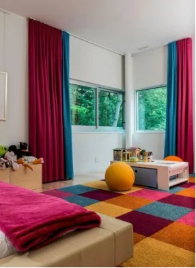
Designers are encouraged to freely explore and experiment with colour combinations that evoke their desired emotions and elicit the most appealing feelings. There are no strict rules about which colours cannot be mixed. The essential principle is to explore various colour combinations and to discover what works and resonates for you.
What is the most important rule of Colour Mixing- Any colours can be combined as desired.
As noted earlier, there are no strict rules regarding colour mixing. Any colours can be combined as desired, opening up limitless possibilities and options. However, there are methods and techniques that can enhance the results.
To mix colours effectively and achieve your desired design vision, it is essential to understand concepts like brightness and saturation.
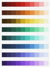
1 – Brightness (Luminance or Value)
Brightness refers to the lightness or darkness of a colour. To adjust a colour’s brightness, gradually add white to lighten it or black to darken it. This can shift the colour along the spectrum, from a bright hue to a deeper, nearly black shade. Understanding how to manipulate brightness can enhance depth and dimension while also shaping the emotional tone of a design.
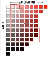
2 – Saturation
Saturation refers to the intensity or purity of a colour. A colour’s saturation can be lowered by gradually adding gray, which makes the colour appear more faded and muted. As more gray is added, the colour ultimately transforms into a neutral gray tone.
It is important to note that colours harmonize and complement each other well when they are balanced in brightness and saturation. This balance enhances the designs and compositions, making them more visually pleasing.
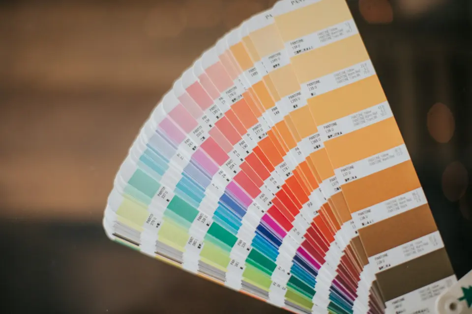
A colour fan deck from paint manufacturers is an excellent tool for choosing a harmonious colour palette.
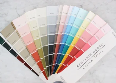
To ensure the colours work well together, it is a good idea to test them on Different Walls and observe how they look under various lighting conditions and shadows.
A Final Tip
When planning your color scheme, take your time and avoid rushing into a decision. Consider which colours most influence your emotions and mood, and choose those that will help you achieve your desired results.
Bring small paint colour samples into your home and test them on different walls under different lighting conditions. Take your time to see how different colors interact with each other in your space.
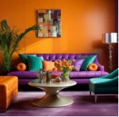
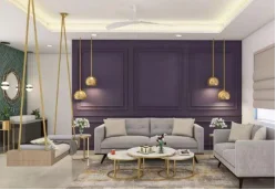
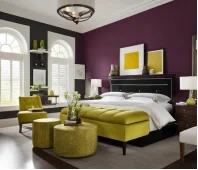
Stay tuned for our next post, where we will discuss what to avoid when combining colours and the optical effects of certain choices.
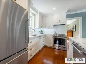
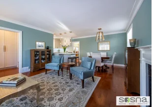
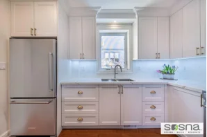
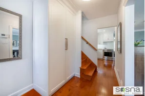
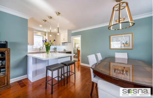
At Sosna, we understand that choosing the right colours for your renovation can feel overwhelming. That’s why our team of experienced designers, like myself, are here to guide you through the entire process. From providing insights on colour theory to helping you visualize how different shades will look in your space, we ensure that your new colour palette complements your home’s style and enhances the atmosphere you want to create. Whether you’re seeking bold contrast or subtle harmony, we’ll work with you to make confident and informed choices. Ready to transform your home with the perfect colours? Contact us to get started!
Author: Olga Sverdlova
978 Views
