What do you do when your home’s bathrooms just aren’t up to the job anymore? It’s time for a bathroom blitz! When our clients found themselves living with bathrooms that were dark, uncomfortable, or difficult to use, they turned to Sosna for help. They are a young couple with demanding professional schedules and a young child who needed multiple bathrooms that fit their changing needs. Our clients wanted to bring their bathrooms into today with modern materials and update them with their personal tastes in mind. Yet functionality also remained a major priority from the very start. Thanks to decades of experience in updating older homes across the Maple area, we were able to identify multiple options for improving the clients’ bathrooms without going over their budget or time frame. See what we pulled off for clients on this project and you just might feel inspired to arrange some bathroom improvements of your very own.
Renovation Details
- Project Price:
- Designer:
- Project Manager:
- Leo Soudat
- Design Timeline:
- 2 Months: December 10, 2021 – February 18, 2022
- Construction Timeline:
- 3 Months: March 24, 2022 – June 24, 2022
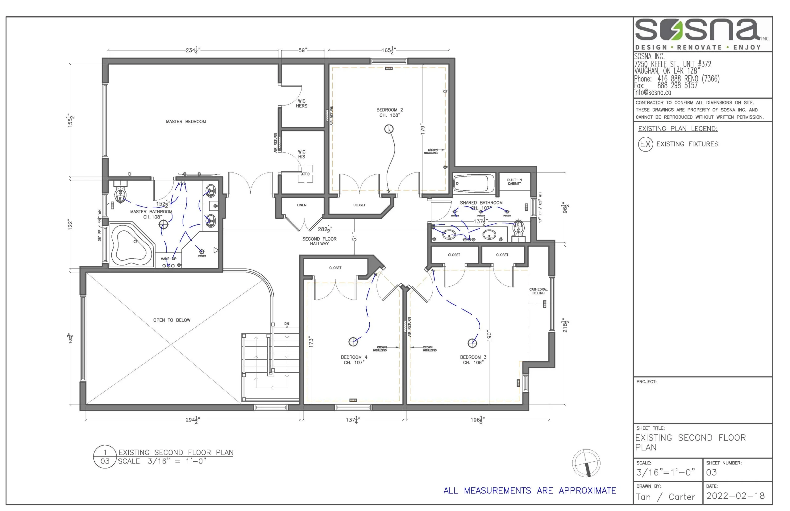
- Pre-Renovation Drawings:
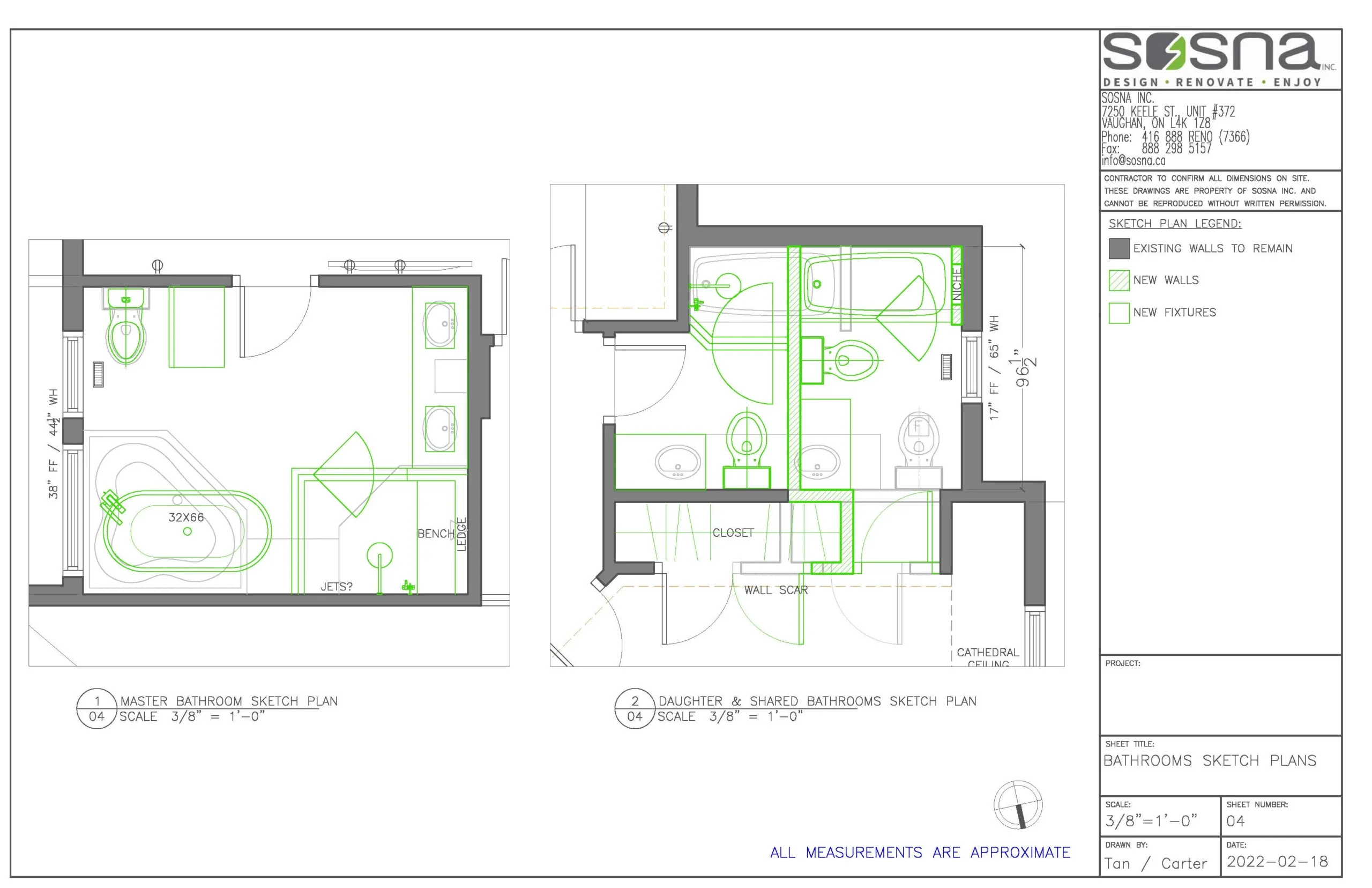
- Proposed Renovation Drawings:
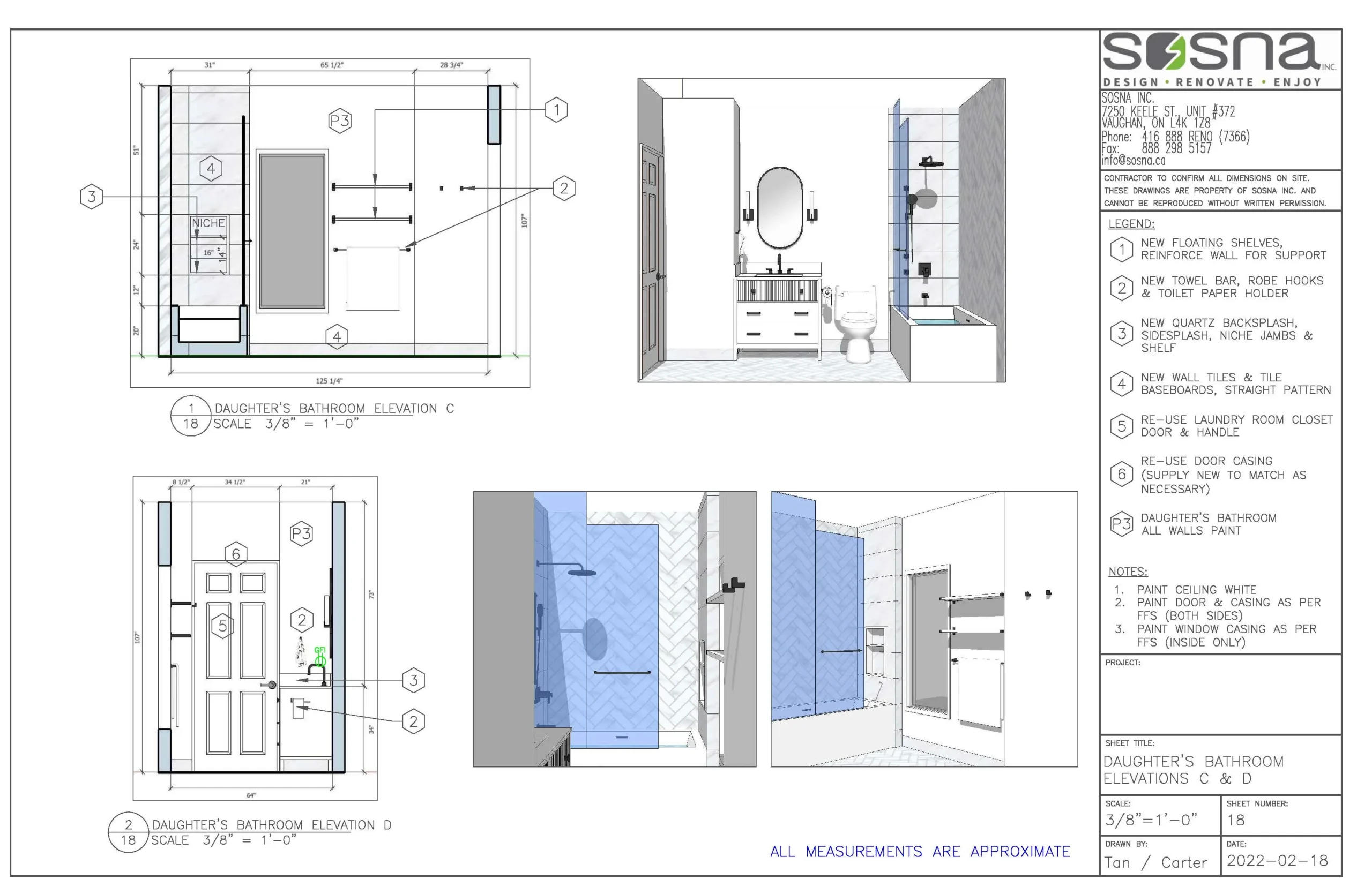
- Proposed 3D Drawings:
Setting the Scene for Better Bathroom Designs
These clients reached out to us after realizing their 14-year-old home was ready for some improvements. Their primary goals were two-fold: Personalize the bathrooms and the Laundry area so that these spaces actually reflect their sense of style and their lifestyles • Increase the functionality of both of these spaces at the same time, improving efficiency whether showering before a big day or dealing with the laundry. We dedicated plenty of time to the pre-planning and design stages of the process. We worked closely with the clients to select colors, materials, and designs that felt right to them and appealed to both of their personal styles. It’s always a balancing job to create interior designs that make everyone in the family happy, but it’s something we take seriously so our customers love their renovated homes for years to come.
Master Ensuite Improvements: Brighter and Lighter Than Ever Before
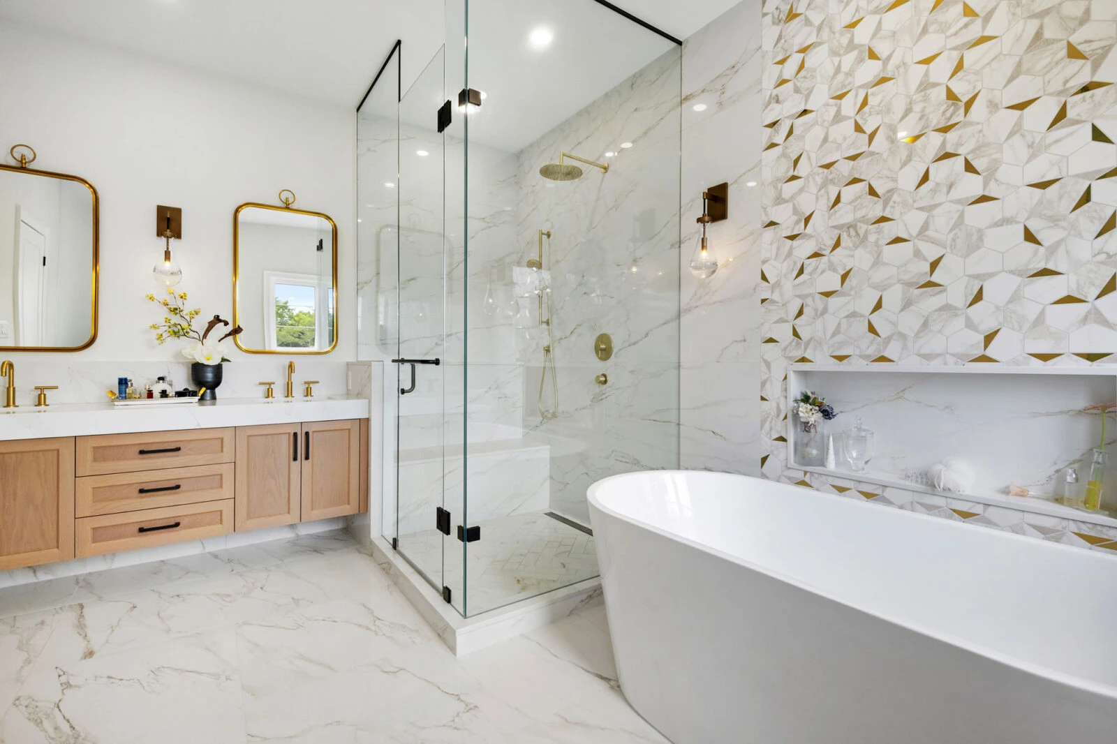
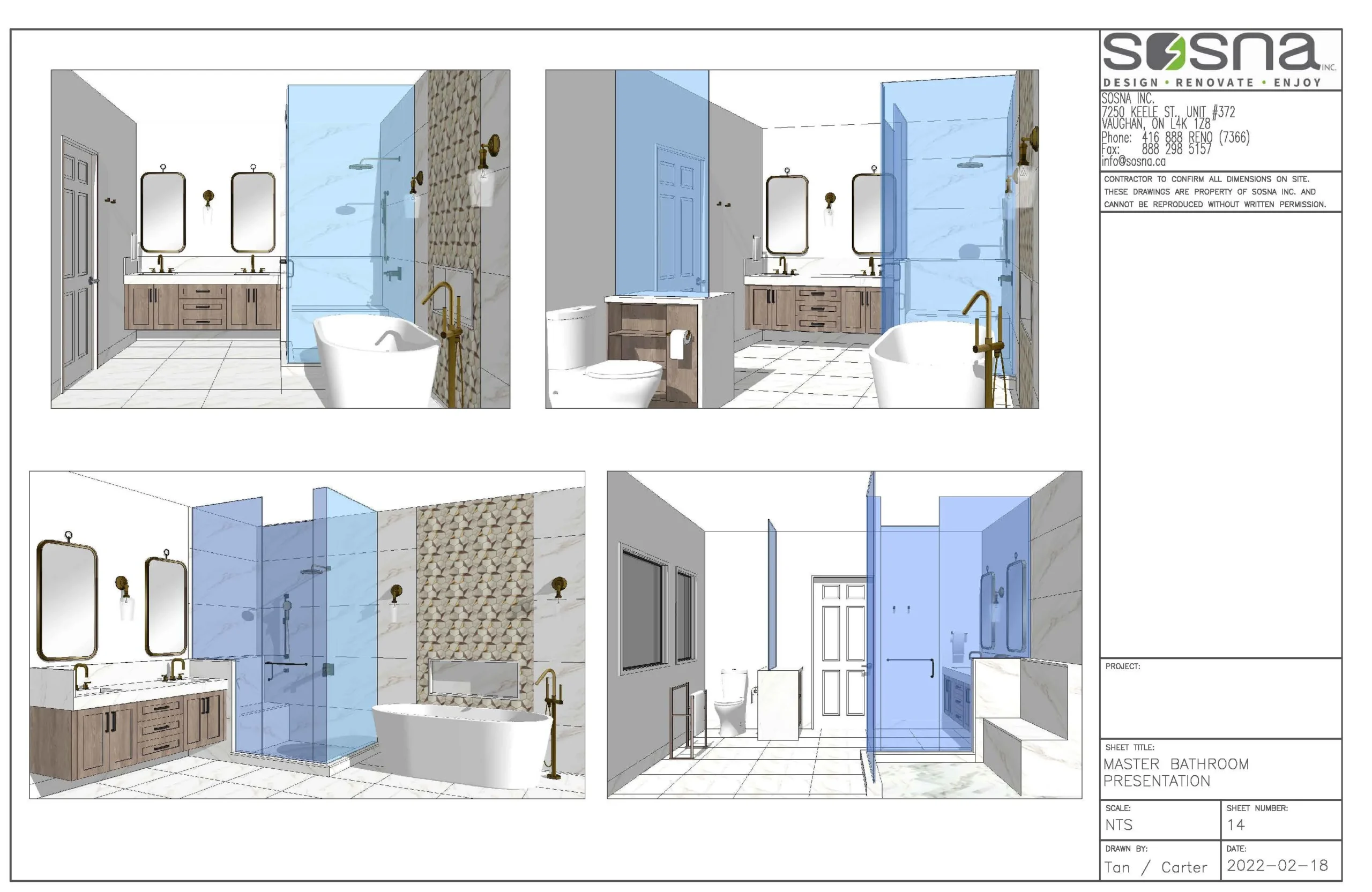
The Master Ensuite was the first bathroom that we tackled because it was the largest and needed the most improvements. The space was centered around a shower that was uncomfortable to use and surprisingly dark. While it offered plenty of space, the shower stall wasn’t optimized for actual use and lacked the lighting necessary for a relaxing yet efficient cleaning experience. There was a built-in corner tub that had a dated design and took up too much valuable floor space. It was hard to move around the room without bumping a shin, especially at night. Our goal was to update the appearance of the Master Bathroom while also eliminating the issues interfering with the clients’ daily routines. We transformed the room with a number of improvements that worked together in conjunction to create the elegant and refined look our clients wanted. First, we removed the cumbersome corner tub that was difficult to use. In its place, we installed a beautiful freestanding tub with a modern style and comfortable shape. The bright white color makes it easy to spot even in low light. Behind the tub, we installed a gorgeous feature wall that was accented with brass highlights, a custom mosaic, and raindrop sconces. Next, we rebuilt the walk-in shower enclosure with an all-glass design that made a lot more sense for the space. This lets in plenty of natural and artificial lighting for a properly lit showering experience. It’s not just a matter of accurate shaving but also a safety consideration to prevent falls. There’s even a built-in bench included in the shower stall design for relaxation and to aid when bathing with limited mobility. The new shower enclosure is much brighter and more welcoming than the old design, not to mention more functional. Finally, we wrapped up the renovation in this room with new custom cabinetry and a custom-built quartz counter top double vanity. White Oak gave the double vanity a much lighter color palette and a more modern look than the previous cabinetry. On top of the extra storage cabinets we added an etched glass barrier for a little more privacy around the upgraded toilet. The effect was quite impressive, as you can tell from these before and after photos. It’s hard to even tell it’s the same room, especially once we added in extensive new low-profile lighting and luxurious flooring.
Creating Two Bathrooms From a Single Lackluster Space
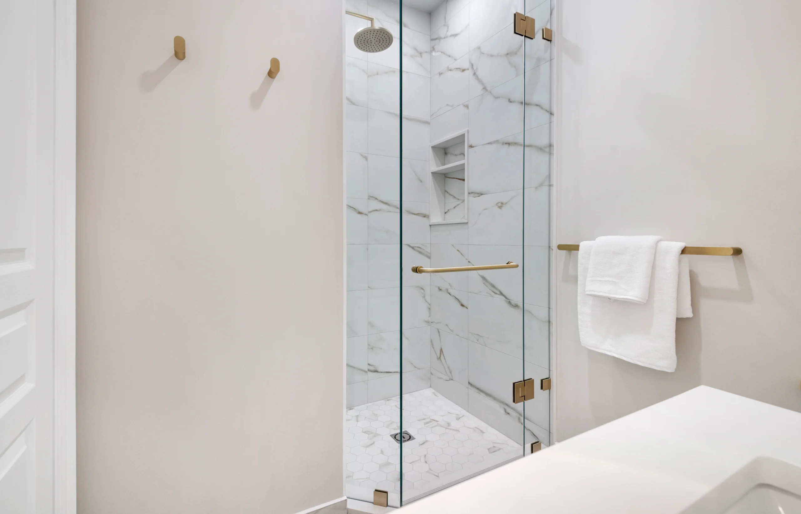
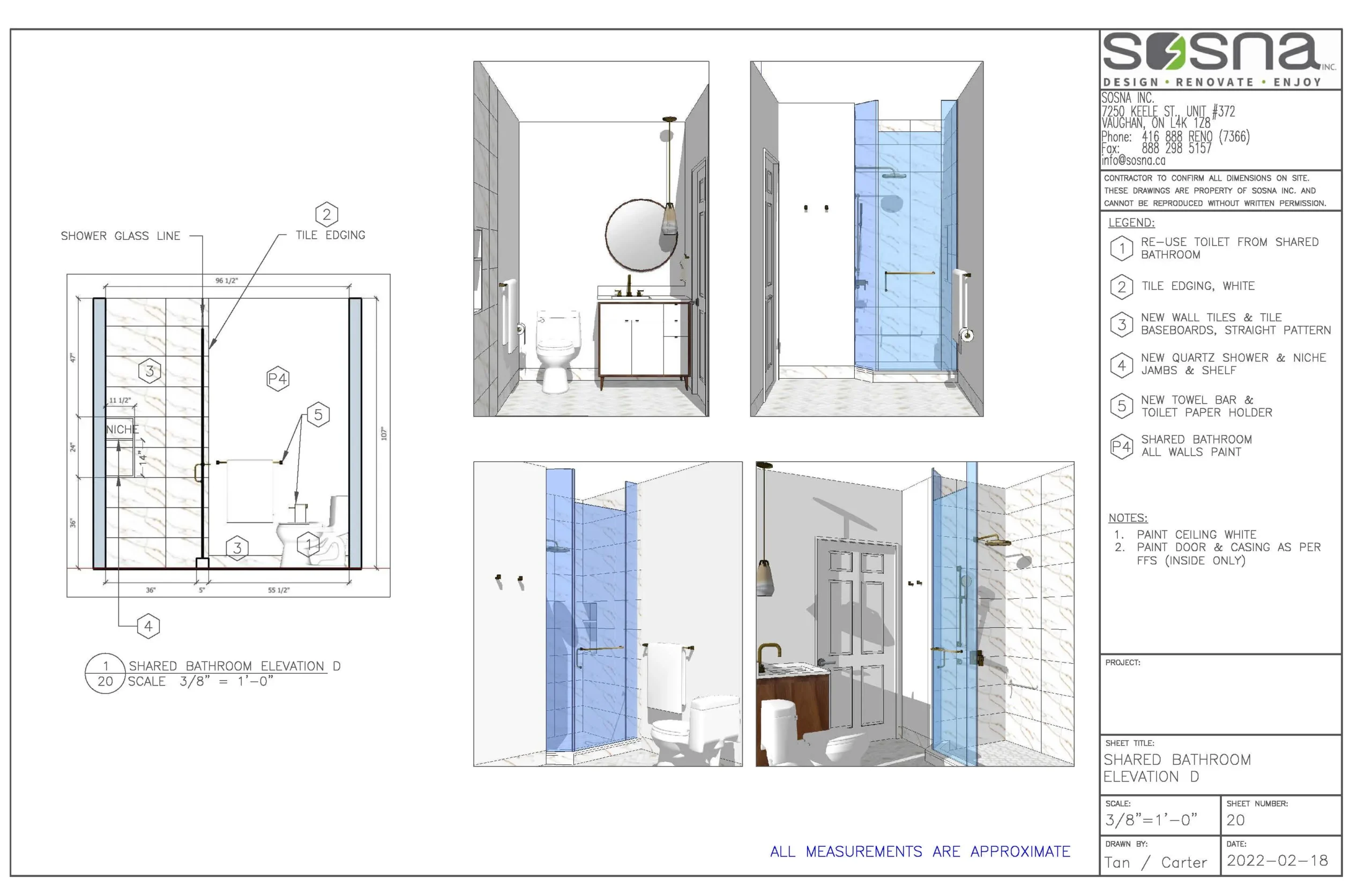
Once the Master Bathroom had a whole new look, it was time to turn to another part of the home. Our clients wanted their daughter to enjoy her own Ensuite space, but the current Bathroom wasn’t the best fit for that arrangement. We put our creativity to good use by splitting the existing Bathroom into two different spaces, creating a better Guest Bathroom experience while also providing the Ensuite needed. The two smaller bathrooms featured optimized layouts and space-saving features that made them each feel more spacious than the original room. In the shared bathroom, we added a walk-in shower that was perfect for guests who need to freshen up. A sleek black and white color palette kept the space elegant and welcoming while also streamlining the cleaning experience for the homeowners. For the daughter’s Ensuite Bathroom, our team chose a tub that would work well for the child for years to come. Both of the new bathrooms received new vanities, black and brass plumbing fixtures, and high-end porcelain tiles in stylish patterns. Ventilation and lighting ensure that the spaces feel far more spacious than they really are, making the most of every square foot in this Maple home.
Tying the Home Renovation Together with a Laundry Room Overhaul
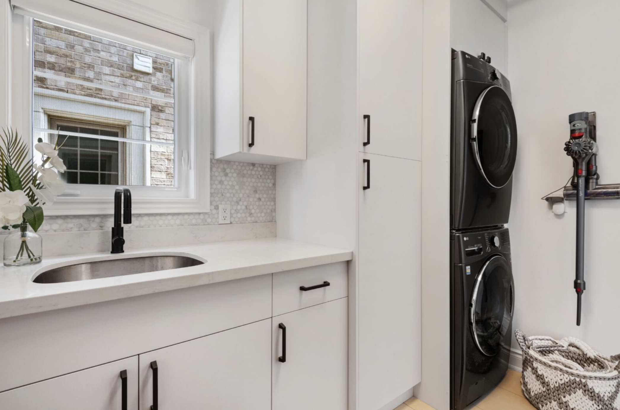
The bathrooms weren’t the only parts of the home that our clients wanted to update. They were also more than ready for a modernized Laundry Room that helped them stay on top of family chores without requiring a lot of extra work. We knew we could make the area much more attractive and functional without any major renovations. All it took was some custom cabinetry to make the most of the space and expand the enclosed storage options for a tidier look. Specialty laundry supplies and out-of-season clothes all have their place now in the new Laundry Room. We also stacked the washer and dryer to free up floor space for more built-in storage. Sometimes it only takes small changes like this one to make a big difference. The increased access to the washing and drying stack allowed us to introduce a bench with its own cubbies. It’s easy for the entire family to hang coats, remove snow boots, and deal with shoelaces without tracking dirt into the rest of the Main Floor. The Laundry Room is now a multi-purpose space that also serves as a Mud Room, making the most of what was once a cramped and inefficient part of the home. As with the other parts of the home, we stuck with a neutral color palette with plenty of contrast and hints of natural wood to bring warmth to the design.
Another Success with Sosna
We specialize in taking our time to formulate a design that truly reflects the clients, and that led to yet another success with this project. Our clients were overjoyed to see their new bathroom spaces and couldn’t wait to experience the new showering and bathing environments. We were glad we could help streamline their daily routines as a family while also reflecting their personalities in their home in a more direct way. With a Laundry Room that has plenty of storage and a Master Ensuite that’s filled with light, this Maple home has a much more modern feel for residents and guests alike.
Let Our Clients Tell You All About It
Hear directly from these happy clients about their Sosna home renovation experience!
Contact Us to Get Started
Ready to transform your own Toronto area bathrooms and laundry room into stylish and functional spaces? Contact Sosna today for a free consultation!
Author: Camila Tan
2469 Views

